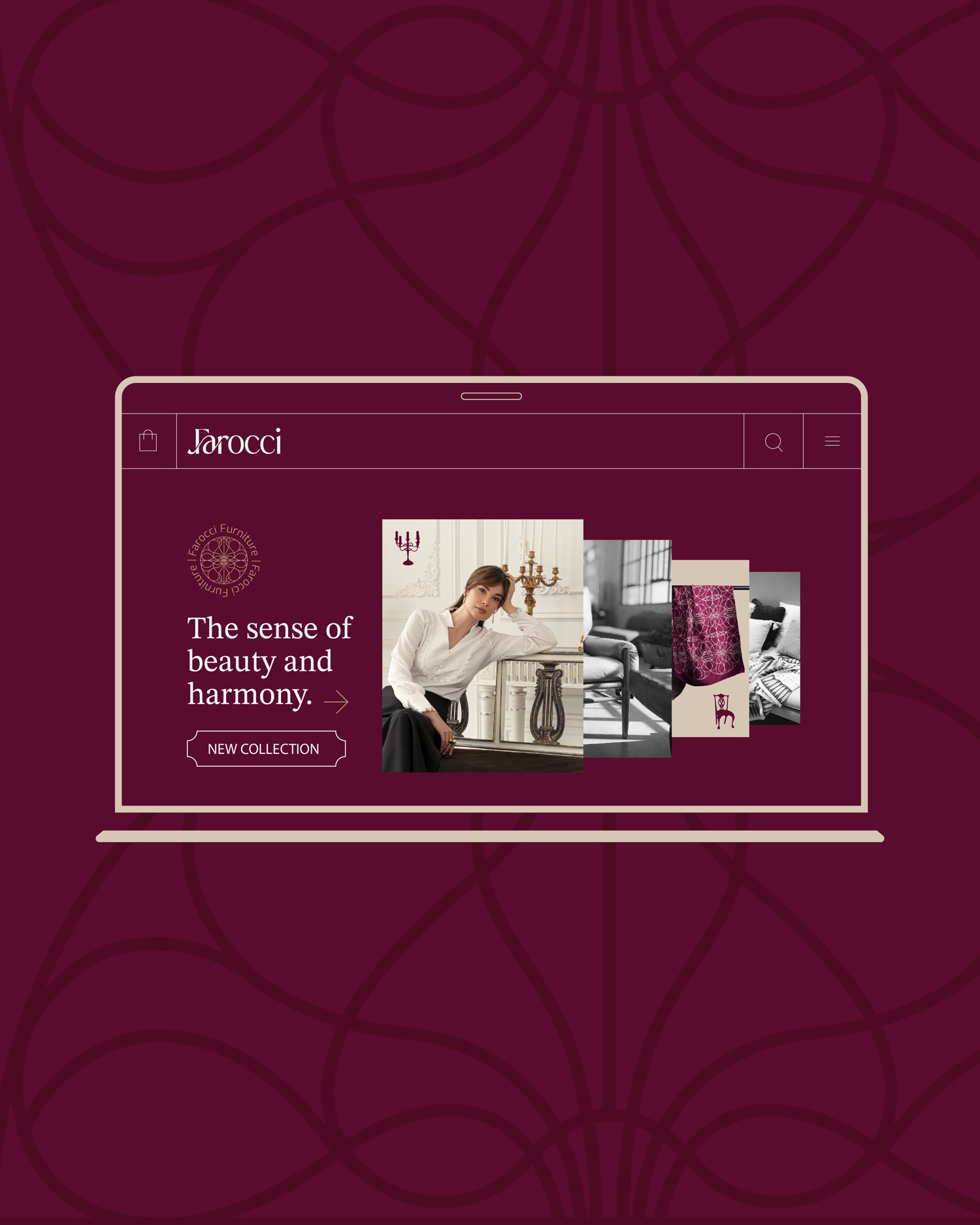
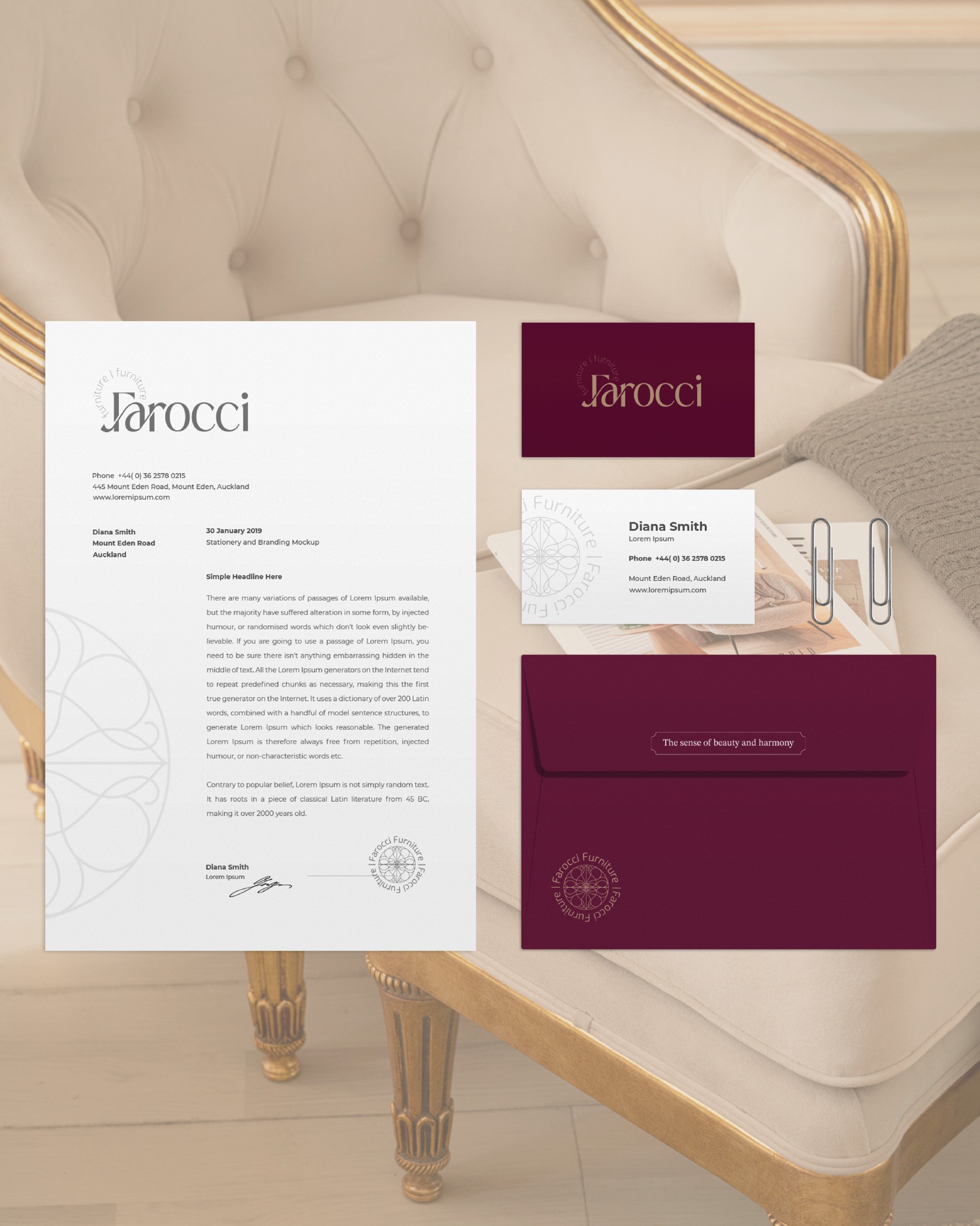
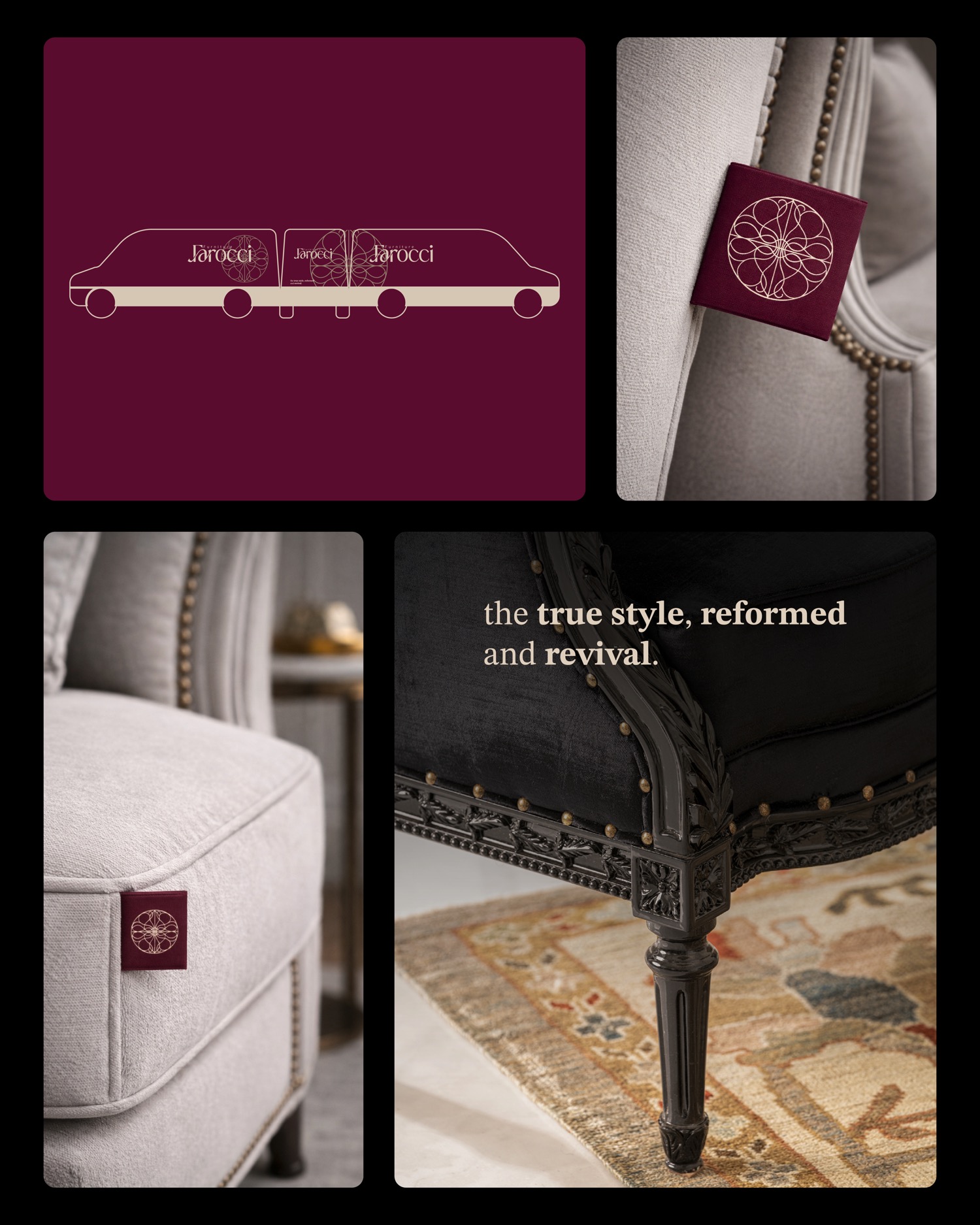
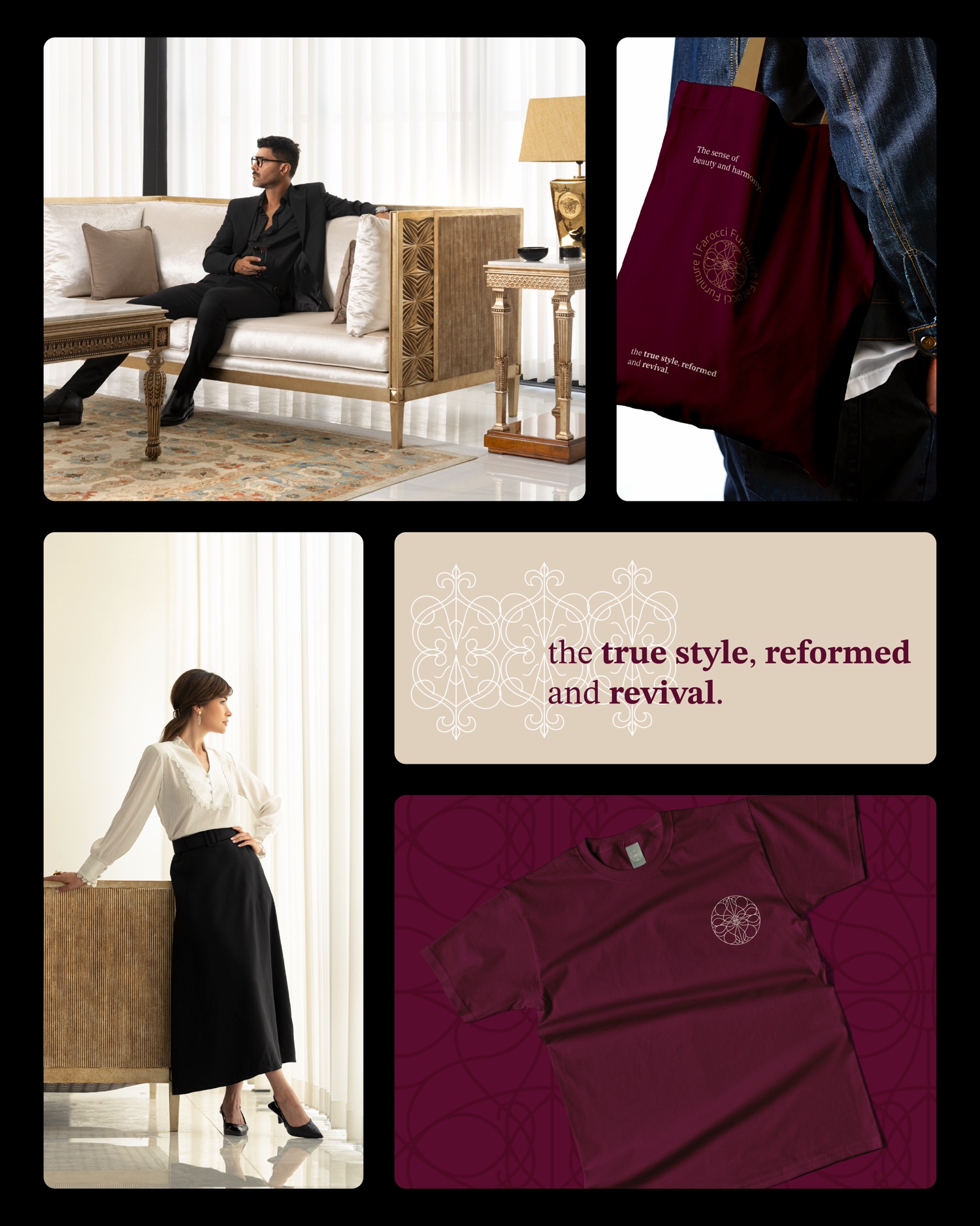
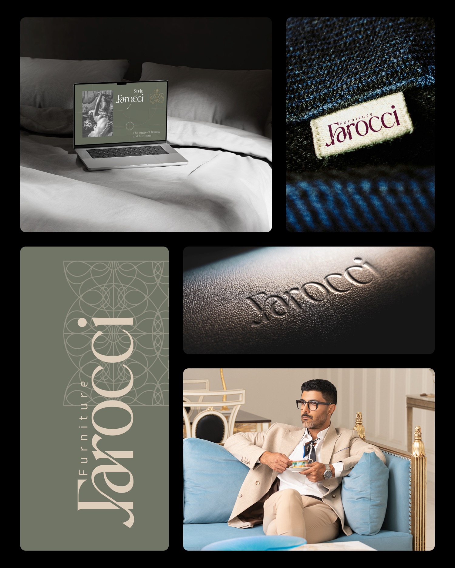
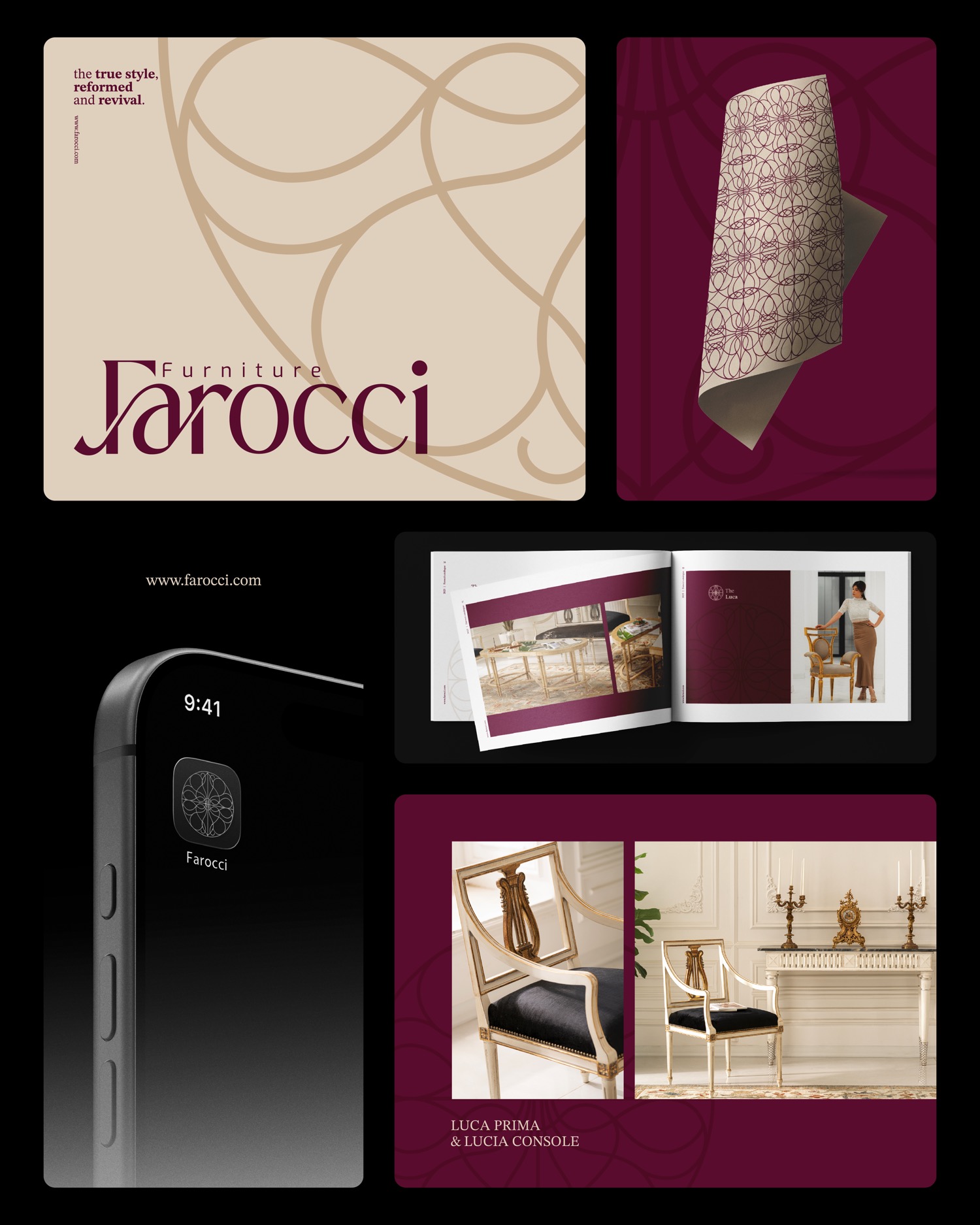
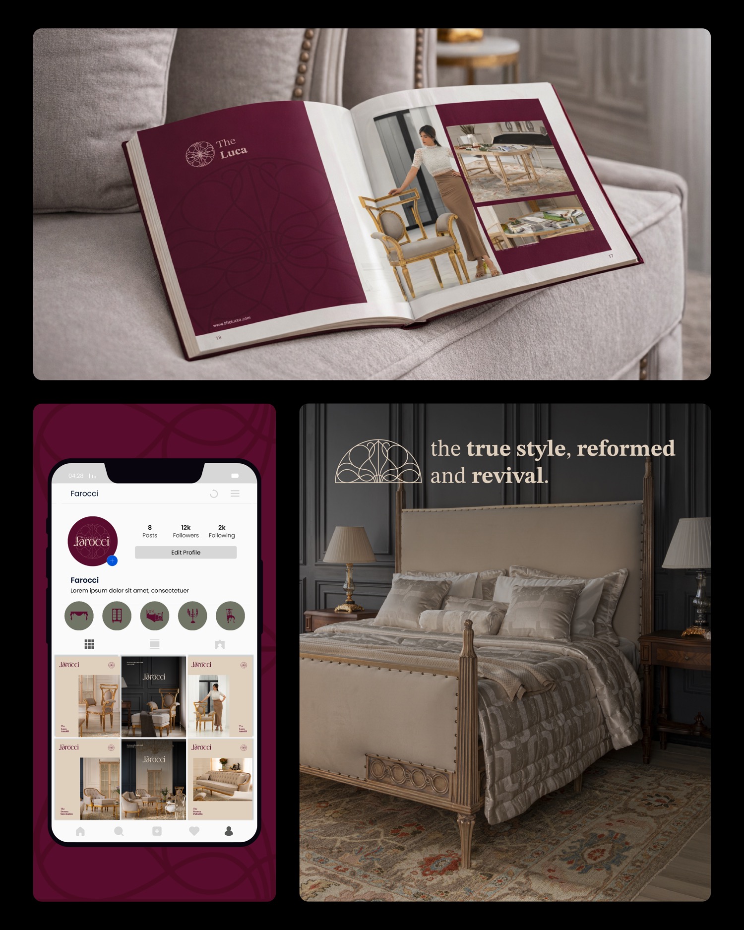
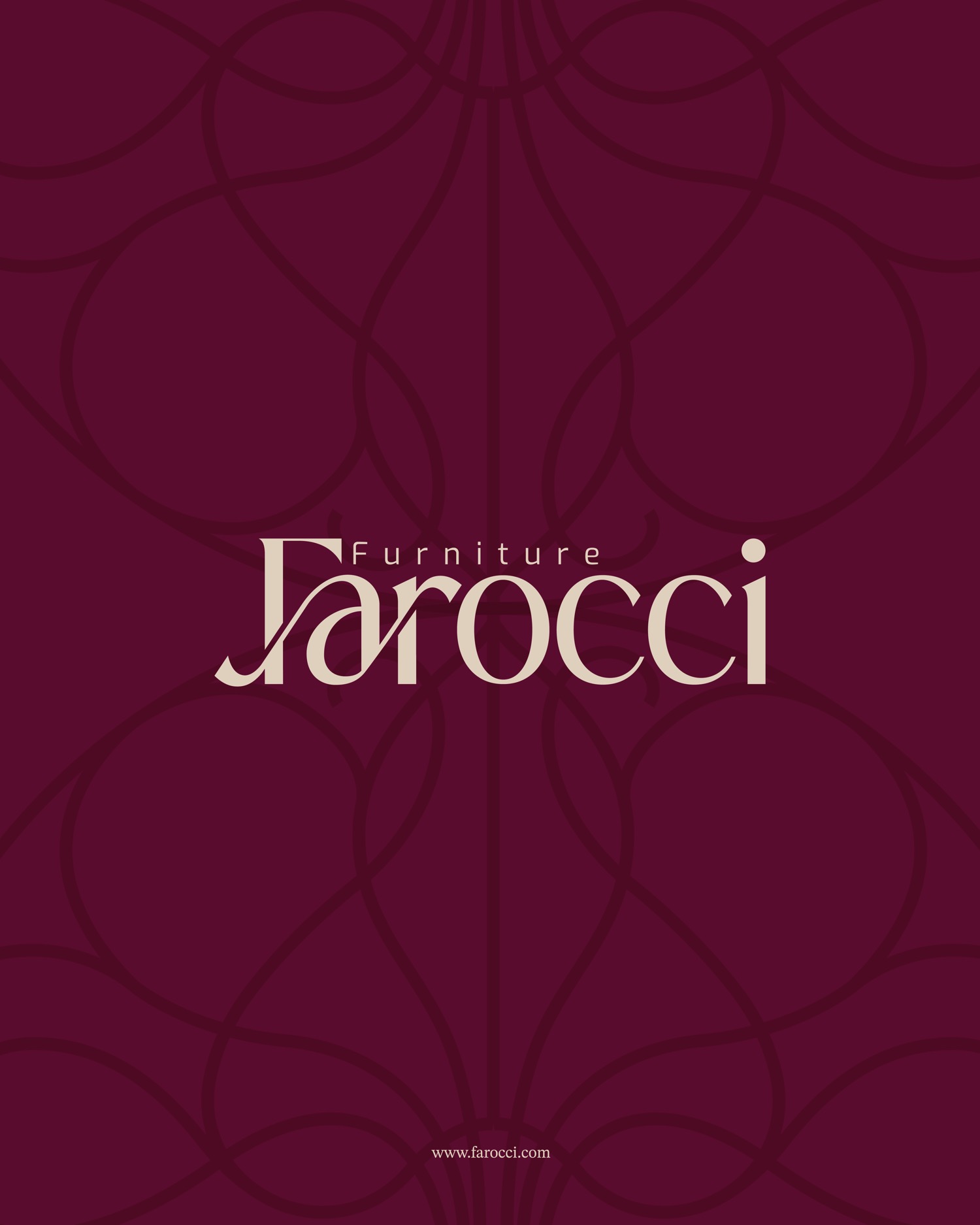
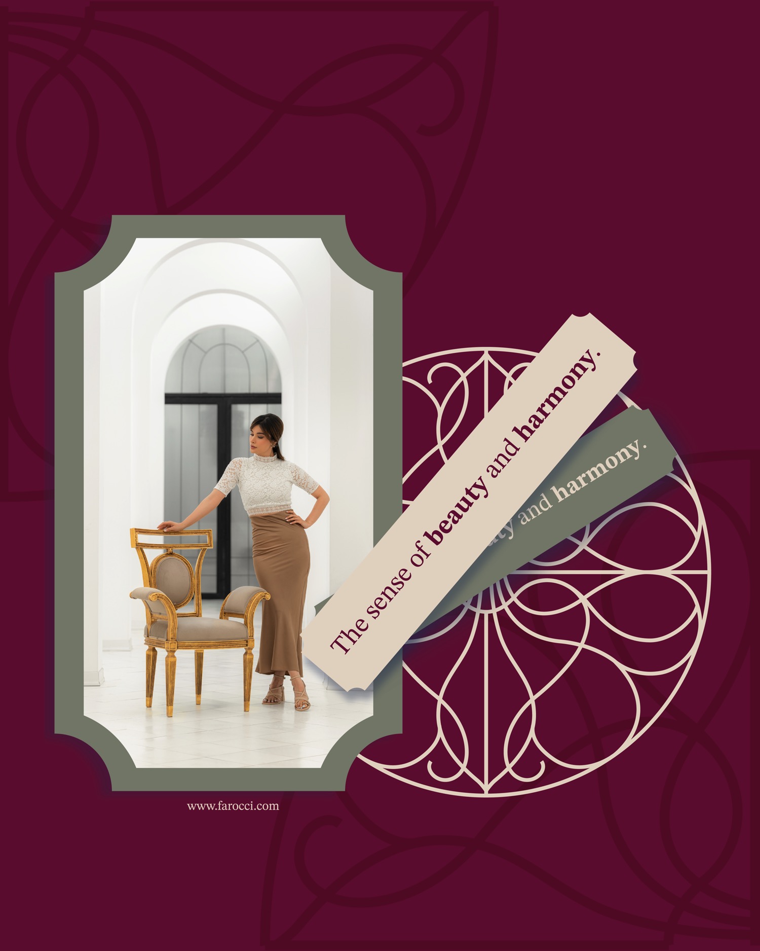
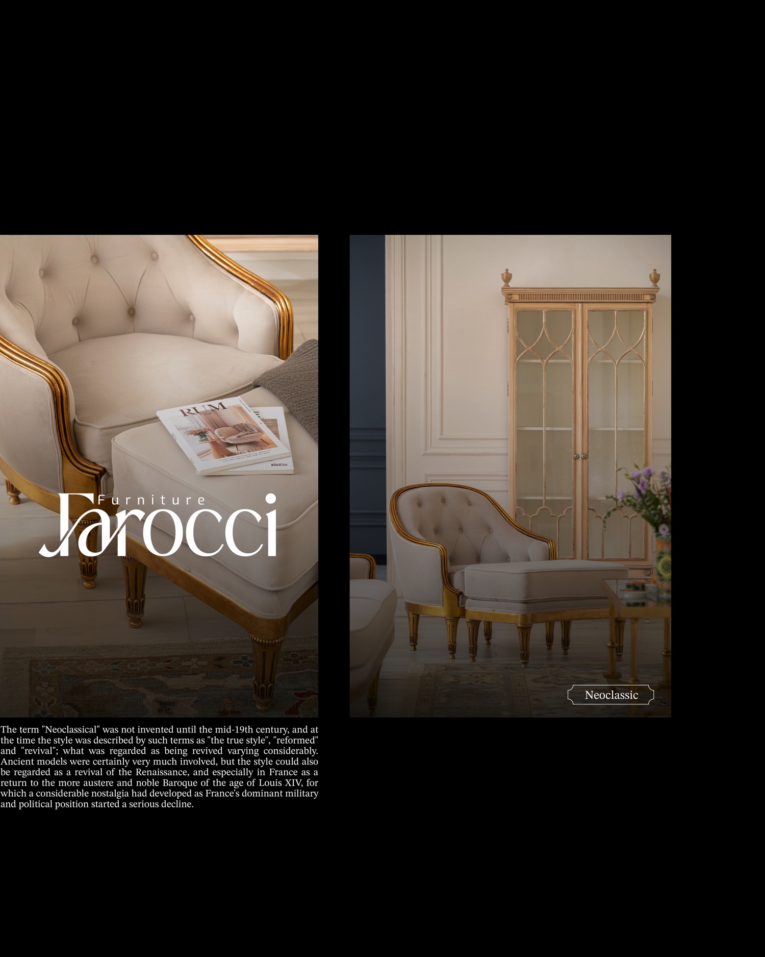
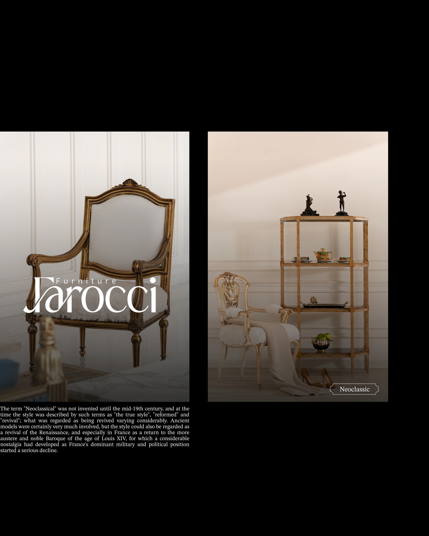
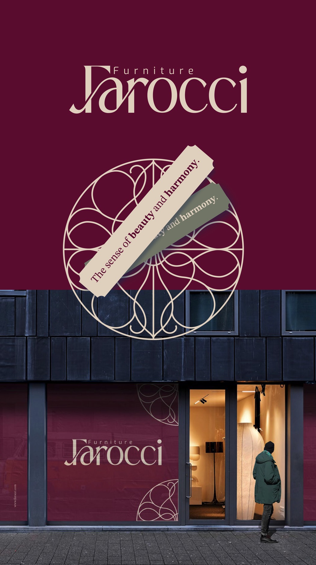
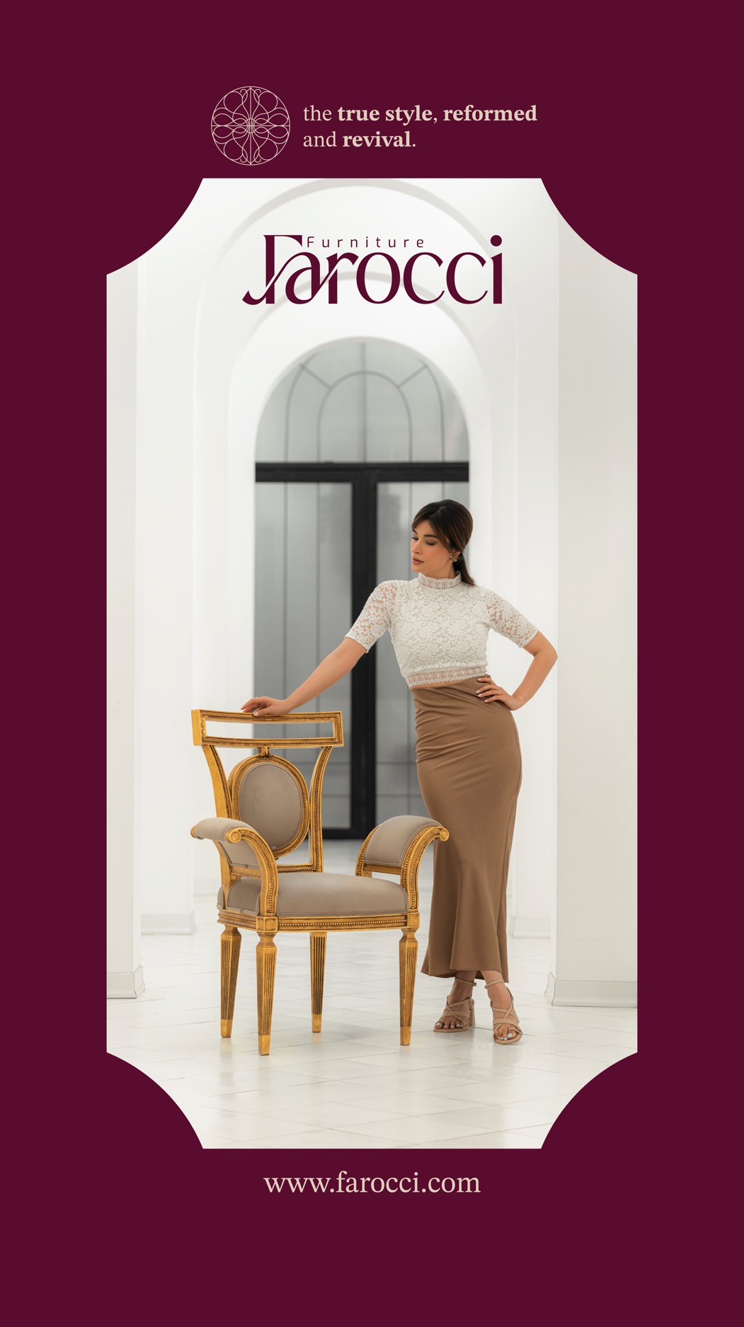
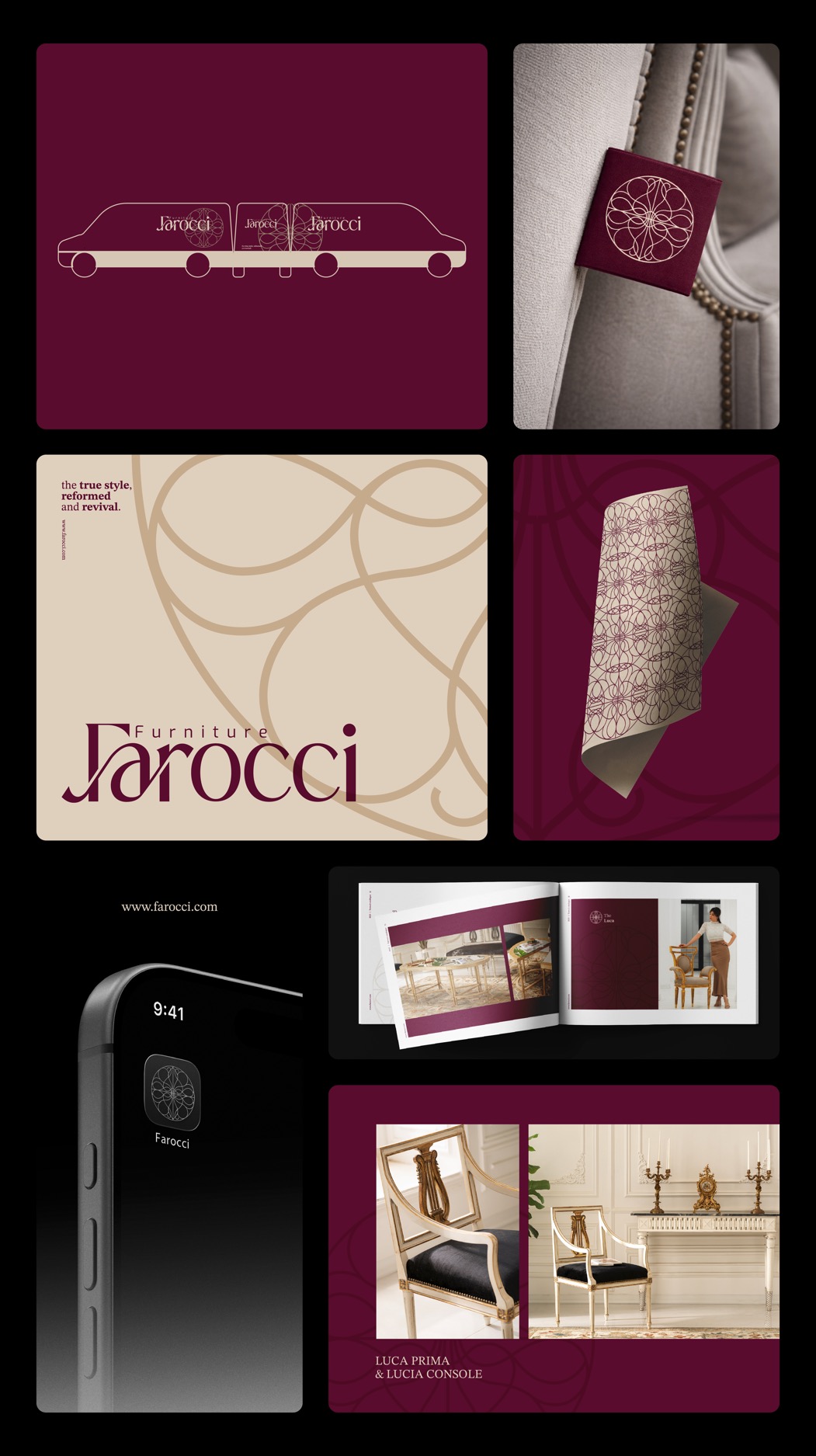
Baroque grandeur was a language of power, movement, and awe, a style that expressed authority through contrast, exuberant detail, and monumental scale. Over time, however, this grandeur moved away from excess and evolved into a more disciplined order, where ornament remained but gained renewed meaning. Within this transition emerged a perspective later known as Neoclassicism; not a mere return to the past, but a reinterpretation rooted in balance, reason, and formal perfection. Farocci is shaped along this very narrative, an identity that balances grandeur with restraint. Neither theatrical nor excessive, neither cold nor imitative. At Farocci, luxury is not defined by embellishment, but by a deep understanding of form, material, and time. The brand’s color palette is a visual translation of this philosophy. A deep wine tone recalls power and the dramatic atmospheres of Baroque interiors; an olive-leaning grey embodies order, rationality, and control; and a warm, luminous cream, inspired by stone and natural surfaces, introduces warmth and visual breath. Together, these colors create a continuous narrative, moving from authority to refinement. The Farocci symbol is designed with a circular, symmetrical form, a sign of perfection, continuity, and timelessness. The interwoven lines within it reference the controlled ornamentation and marquetry of late Baroque craftsmanship, purposeful details that preserve movement within structure. This mark is not a reproduction of history, but a contemporary translation of grandeur, refined to endure.
Year: 2024
Services: Art Direction, Branding, Environmental Design, Motion Design, Packaging, Visual Identity